Friday 2 October 2009
I'm back
After spending a while in Spain I am back and back to business. Daily posts (or something like that) ahead!
Saturday 29 August 2009
Ohio is a piano
Ohio has 88 counties. A piano has 88 keys. Put the two together and you get some crazy sounding stuff.
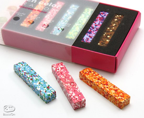
You can never have enough crayons
These are some lovely looking Japanese crayons that are inspired by ice cream flavours. I haven't got the fainted idea where you can get them from here, but I want them nonetheless.
I wish I had thought of this (mark one)

So, I just started knitting. Well, rather trying to knit. It's not going quite as rapidly as anticipated (I blame it on knitting being unfriendly to left-handers) but I am getting there slowly but surely. I am determined to have knitted a jumper by Christmas as a hard earned gift to myself. Anyway, I digress. I found this company online 'Wool and the Gang' which is a real incentive to start making stuff. Basically you choose what exactly you want to knit from their collection online (whether it be a jumper/hat/bag, whatever), you choose the colour, and then they send you the wool, needles, pattern, sewing needle and a customisation kit. Clever indeed (oh and for those too lazy to bother knitting, but want to look like they aren't, there are finished products ready to buy). It is nice to see knitting not looking so naff. Not that that ever stopped me...
Friday 28 August 2009


Richard Sanderson


I have officially become a fan of Richard Sanderson's work. He is a recent UWE graduate in illustration, and what I like so much about his work is that it doesn't take itself too seriously. It all looks as though it has been drawn with real enthusiasm without worrying whether it is right / in style / serious enough (which are stupid things I seem to worry about far too much). Maybe he does worry about these things (maybe we all do...?) but that's not the impression his work gives off. I am now going to go draw some stuff and hopefully it will turn out half as good as this.
Keep it complicated

I haven't been brave enough to try designing my own typeface yet, but the work of Sveinn Davidsson is making me want to try! I don't know what it is with me and nautical things (worryingly I now have at least nine striped t-shirts in regular rotation in my wardrobe), but I love this Times New Rope typeface. I'm increasingly drawn to hand-drawn/illustrative typefaces recently as it seems almost impossible to improve on some of the great existing typefaces. Speaking of hand-drawn typography, I have just remembered another post I've been meaning to make!
Tactile type


Thursday 27 August 2009
To infinity and beyond!


Although I must admit, I am dubious as to whether man really did walk on the moon in 1969 (I am partial to a good conspiracy theory), but I do have NASA to thank for these amazing images of space. They are almost to beautiful to be real.
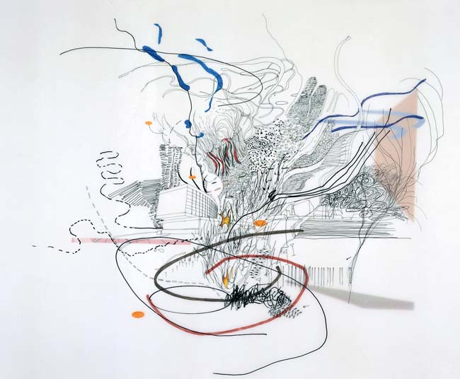
Julie Mehretu


Sorry!
Hello, I haven't updated my blog for a long time, I've been pretty busy with moving back to Sheffield and such, and it's quite easy to get out of the habit of posting regularly. But all that is about to change! I promise!
Saturday 16 May 2009
Le Corbusier's vision


'...I have decided to make beauty by contrast. I will find its complement and establish a play between crudity and finesse, between the dull and the intense, between precision and accident. I will make people think and reflect, this is the reason for the violent, clamorous, triumphant polychromy of the facades.'
The building's main objective was to stress innovation through a radical renewal of the traditional structure on a spacial and functional level. Measurements were based on his own grid system of the Modulor. The use of new materials was introduced, and were technical solutions to control sound, light, and ventilation and to create new uses in living space.
Despite all of these technical details, the two main points were to :
1) Provide the perfect residency for a family, while facing the sun, the surrounding space, and nature in silence and solitude
2) Erect a majestic architectural work build of rigor and greatness, of nobility and elegance, and always with a smile under the sky in the direction of the sun and God's nature.
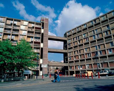
The 1,600 residents were privvy to a variety of services such as a nursery school, hotel, shops, offices, and gymnasium. It has 18 floors and a sun deck roof-terrace with an unobstructed view of the Mediterranean. Trying to recreate this whole aesthetic in industrial northern England where the landscape and climate just do not compare was never going to work. Although some could say Park Hill has succeeded in the fact that it now has listed status, the experiences of many its residents would suggest otherwise.
Where did Park Hill, Sheffield succeed where Hulme Crescents failed?


Being from Sheffield myself, it is interesting to see the comparisons made between Park Hill and Hulme Crescents. Both having been built on the basis of LeCorbusier's Unite d'Habitiation in Marseilles; one is now demolished and looked upon with distain, whereas the other is now Europe's largest listed building and is viewed as a building of architectural and sociological importance and is part of a major regeneration project by Urban Splash?
Whenever I went into Sheffield city centre I always looked up at the Park Hill Estate and counted my blessings that I didn't live there. It always looked like an incredibly dank, miserable, and unsafe block of flats. So it came as a great surprise to find out in 1998 that it was being awarded Grade II Listed Status and that it was to be the recipient of a £160 million renovation by Urban Splash. Like Hulme Crescents, Park Hill (designed by Ivor Smith and Jack Lynn) was seen as the future. The flats dominate the local skyline and earned the nick name of 'the streets in the sky' due to the fact that inter connecting walk ways stretch from each adjacent block. The streets where named, The Pavement, Gilbert Row, Hague Row, Long Henry Row and Norwich Row, and where that wide a Milk Float could actually drive down them via coming up the service lifts. Park Hill at the time was seen as the way forward, Construction is of an exposed concrete frame with yellow, orange and red brick curtain walling, which over the years has been stained by soot from passing trains. Sadly though, as with Hulme Crescents, although not to the same degree, the flats become overrun with drugs and crime and resident numbers diminished.
So, what made Park Hill the beacon of Modernist urban housing and Hulme Crescents a site worthy of demolition? Well the general consensus is that it was all down to the feeling of community. The residents of the terraced housing which preceded Park Hill were all relocated together to the new estate, bringing with them a sense of community. The residents of Hulme's Victorian slums, however, were sent to live in new housing schemes all over the Manchester area, from Wythenshaw, to Moss Side, and so the Crecents' residents were now strangers to one another and there was no sense of community whatsoever. This, in addition that Hulme was of a much poorer build quality to Park Hill. With this type of Brutalist mass housing design still only being theory to Britain at this point, the reality was that Manchester's rainy climate did not agree with the concrete structure on the Crescents'. The Unite d'Habitiation in Marseille's warm and dry climate has fared much better!
Hulme Crescents


In October I attended a meeting about the regeneration of Hulme and the possibility of mapping the changes and developments of the topology itself and also the residents reactions to this. The main subject up for discussion was Hulme Crescents, and how it had effected the atmosphere and development of Hulme itself. It is strange to think how the design of a block of flats can affect the behaviour of those that live in or close to it, but history speaks for itself. Hulme was originally home to Manchester's cotton weaves, until in 1960 it became the site of the biggest slum clearance in Europe. The terraced houses there were declared inhabitable and a new housing scheme was needed to rehouse the residents.
During this time the Le Corbusier style of Brutalist architecture was very popular amongst blocks of flats, and the proposed Hulme Crescents were influenced by this whilst being based on the crescents in Bath. At the time, the Crescents won several design awards, but quite soon the ideology of vehicles and pedestrians being separated by elevated walkways, and green spaces being created for families, turned the Crescents into an unsafe place live, with many 'dead areas' where gangs began to gather. Quite soon families began to leave. The flats had no defensible space, the only heating was via air ducts which soon posed damp and pest control problems. This, on top of the fact that the Princes Parkway runs through Hulme with around half a million vehicles on the road every week all culminated to give Hulme the accolade of the worst ward in the United Kingdom. Rates of drug addiction and crime soared in the neighbourhoods and local reports suggest that as the City Council almost completely lost control of the properties on the estate, it was reduced to handing out keys to properties to anyone who would take them, in order to ensure the use of empty properties. Any sense of community had, by this point, disappeared. Despite this, in the 1970s many punks, musicians ad artists took advantage of the cheap urban housing available and the a club on Royce Road called The Russell club (which was owned and run by Factory Records) featured the first ever performance of Joy Division and various other bands which would eventually become household names, such as Iggy Pop. The epicenter of all the action however was a club called The Kitchen, which consisted of three flats on the third floor of the Crescents, which had been knocked through with a pick axe into one giant squat/club. There was a massive sound system in the front room, and the downstairs kitchen had been turned into a bar selling Red Stripe.
Finally the decision was made in the 1990s to demolish the Crescents. They were replaced by a mix of council and private low-rise housing and now the area is much more successful. Old and new residents live side by side, and it has been a desirable place to live for the new generation of city dwellers.
SUBLIMINAL MESSAGES


These Typocalypse posters by Lars Willem Veldkampf explore the sublinimal messages these fonts are feeding you.
Wednesday 13 May 2009
COLOUR
I have decided I need more colour in my life and in my work. My blog now includes a whole two colours (plus my favourite - grey). One step at a time eh.
Tuesday 12 May 2009
I FIGURED IT OUT (WELL... SOME OF IT AT LEAST...)
I realised that what made me most uncomfortable about the video in my previous post was (no, not the morality of it) the inter-splicing of real video footage with animation. Why do I find it so odd? Even when they do this in Family Guy it makes me feel a bit funny. Is this just me? It reminds me a little of when you are semi awake in the morning and then your dreams start to mix in with and respond to the reality around you, making you start to forget what is real and what is imaginary. Strange.
OK, SO I AM OFFICIALLY A VIDEO CONVERT
This made me laugh, and also a tad creeped out. It's by a French director due called Pleix. There seems to be something about French design that always appeals to me - maybe because it doesn't take itself too seriously, which is often where I find myself going wrong. I always try to please other people with my work, instead of creating something that just makes me smile when I look at it. Jonathan Barnbrook said a couple of things that really resonated with me:
1) you attract the type of work you create.
2) put yourself into your work. It should be a visual reflection of your personality.
After thinking about this a fair bit over the last couple of weeks I am starting to really worry. Spending so much time trying to do the 'right' work has left me in a position where I don't even know what I like anymore - the work that appeals to me doesn't resemble the work I create, and surely this isn't a good thing? Maybe I am just worrying too much (again) but I guess time will tell!
KITCHEN DELIGHTS

I seem to enjoy buying home accessories more than clothes these days. I would like to add these lovely stackable space saving kitchen bowls/measuring devices etc to my collection. I think they're by Joseph Joseph if I remember correctly.
WATCH THIS.

I have never really thought much about motion graphics, but this video has made me want to get involved. It's by the director David Wilson and show how something really simple can be turned into something beautiful.
Saturday 9 May 2009
NIGHTMARE!
Today I spilt tea all over my mac. I did not back up anything up. The screen went black. My some miracle and the cleaning skills of a nice man at the Apple store in Meadowhall, and after four traumatic hours of uncertainty it seems to be working but my keys are all clicky and sticky. I am not happy. I have never ever spilt tea on any computer I have ever have, and 3 weeks before deadline was not a good time to start. I have not enjoyed today one bit. So there.
PROVISIONS LOGOS

These are the final logos for my provisions project I'm working on - they're going to be used in some promotional material for a imaginary store I have created to sell products for days out and weekends away.
Worries.


Does anyone else worry that they are going to spend the rest of their life sat in front of a computer and end up turning into Reginald Perrin?
...and more food (I can see a theme emerging here)


I bought my mum this book for mother's Day but am contemplating stealing it (probably not kosher) or buying it for myself. It is so nicely put together, and even if you don't like cooking/french food then it's still great to have just to look at. The drawings are by Jose Reis De Matos whose illustrative style is quirky and always makes me smile. The majority of his work seems to be for food packaging / cook books / magazines, nice work if you can get it.
Speaking of food...


We booked dinner at The Zetter on Clerkenwell Road and it was bloody delicious. The 2 for 1 cocktail deal didn't do any harm either!
Subscribe to:
Posts (Atom)
